Okay, so I mentioned there’s this hall bathroom on the bedroom end of the house in Hooterville that desperately needs remodeling. This is what it looked like the day we initially toured the house (a year ago this month, already!).
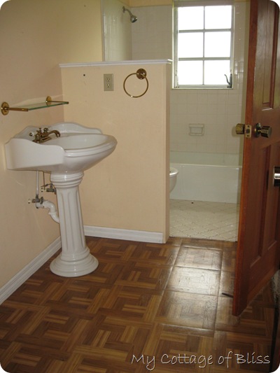
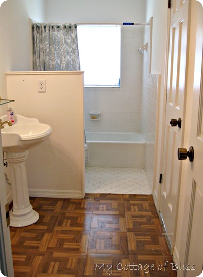
So far, the only thing I have done to it (besides clean it) is paint the doors and trim moldings white, as I did throughout the whole house, and I painted over the peach wall color with a couple coats of some extra white paint I had. I just wanted to freshen it up a bit and bide some time until I could decide what I wanted to do in here, and we had the time to make it happen.
Possible improvements:
-
New bathtub
-
Rip out all existing wall tile and tile only the inside of the tub area
Improvements definitely on the list:
-
New toilet
-
New flooring (probably wood-look vinyl planks)
-
Mirror
-
Lighting
-
Replace pedestal sink
-
NEED. MORE. STORAGE!

As you can see in the above photo, there is lots of wasted space to the left of the sink…almost 5 feet to be exact.
After my cabinet guy gets done with the kitchen, I had planned to have him build a floor-to-ceiling built-in storage cabinet in that corner to the left of the sink.
 *view from the bathtub*
And for MONTHS and MONTHS I have had my heart set on ordering this vanity base (no top) I found on the internet (after hours of searching). I was going to paint it white, put new hardware on it, and have the cabinet guy put a black granite top on it.

Then it would look like this! Isn’t it divine?!
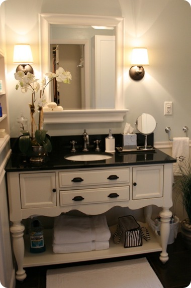 photo source: Rate My Space by user: “Colleen_Christine”
“Colleen_Christine” even had a wall plug installed in one of the cubbies so she could keep her blow dryer plugged in but out of sight. Love this idea!
 photo source: Rate My Space by user: “Colleen_Christine”
But…
There’s always a “but.”
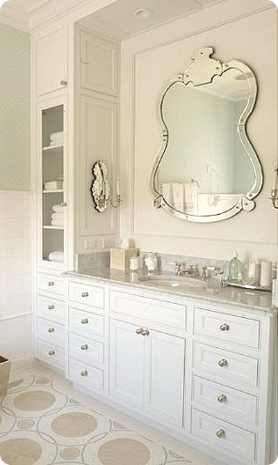
Yesterday I rediscovered this photo below in my inspiration file and I started having second thoughts about my original idea of using the vanity above.
 photo source unknown
The PRACTICAL side of me thought having my cabinet guy build me a storage cabinet/vanity combo like this might be a better choice than the free-standing vanity with the black granite top because this one offers so much more storage. (After living in a small house for so many years, can you tell I’m big on having ample storage?)
So dear readers and decorating enthusiasts, which would be your choice?
A storage cabinet built into the corner, perhaps similar to this…

and used in conjunction with this FREE-STANDING vanity…

~OR~
Just go with a more unified look of an all-in-one storage cabinet and vanity like this…
???
Then I have one other dilemma I want to pose to you for your consideration:
What about the privacy wall?
Would you rip it out to visually open up the bathroom…
or
leave it up, more or less keeping the bathroom divided into 2 sections?

The privacy wall does make it somewhat cramped back here.

 *photo taken standing in the bathtub*
I can’t wait to hear your thoughts on this! If you are a lurker who has never commented before, now is not the time to be shy. I need ideas!


+R+(3)+tilted.jpg)


+green+frame+template.jpg)

+(E).jpg)
+(E).jpg)

+green+border+template.jpg)
.jpg)


14 comments:
Hi Shari..
Both options are nice..
but personally..
I prefer the second choice with all the extra STORAGE!
and I would go with the White granite top.. reflects light better!
the privacy wall? Are you bashful? how many folks in the bath room at the same time..?
Remove it!
warm sandy hugs..
Loui♥
Hi Shari, I would demo that little half wall. I LOVE the freestanding vanity. It's not as practical as the wall of drawers and cabinets but I LOVE the look of it so much more. Perhaps you can compromise by pairing the vanity and some kind of built in storage in the corner near the wall.
Shari,
I have had the same situation as you for the last 37 years. I would rip out the wall and add all the storage space your bathroom can handle. I really like the uniformed look of the second picture. I just don't think you would ever tire of it, PLUS you have all that added storage +++++ Big PLUS!! I am so amazed at how added storage space and walk in closets have freed up our new home.
Jocelyn
http://justalittlesouthernhospitality.blogspot.com/
1. Get rid of the wall.
2. I like the all one piece vanity/storage. It has so much more storage and it looks really nice. I like the free standing vanity with the marble top idea, but I like the other one better.
Hi Shari...
I soooo know what you mean about lots of storage.... The cottage is bitsy and I'm alllllways trying to figure out another place to put things.... AND, I LOVE both bathrooms... They are STUNNING.... But...I must say the black and white one is my fav. I don't know why, but I always gravitate to that color combination.. It's so splashy! And, IMHO I would remove that half wall..... Realllly, is anyone going to be using the potty while somebody brushes their teeth??? :-) Just sayin'...
Can't wait to see what you choose...
Huggies,
Spencer
I'd go for the storage AND I'd rip out the wall (altho I see it has a wall plug - do you need that there?). I don't think you can ever have too much storage!
I would rip out the wall.
As beautiful as the free standing vanity is, I would go with the all in one with all the storage.
You can still put in the black vanity top.
Hi Shari,
I like the free standing cabinet, BUT, I like the built in white storage unit better. It will give you a lot of extra space. If you wanted you could always use the black countertop on that. I would definately take out that wall too.
Debbie
Definitely rip out the privacy wall. I LOVE the white built-in vanity better than the freestanding one with the black top. Too stark. Love all the storage in the built-in white one! You won't tire of that.
I agree with Spencer, Shari! The black and white with the wall gone! It is going to look fantastic whichever you choose!
Have a joyful Sunday!
Becky
Hi Shari,
Since you need storage I suggest going with the built in. However, alter the design so it looks more like the freestanding unit. You can do this by working with your carpenter and playing around with the design. Basically take the features you like best from each piece and create a new design using the parts you prefer.
To make it look like furniture you can purchase decorative tall legs and integrate them into the design or add an apron to the bottom front then add short bun or turned feet under it. You might consider making the sink area jet out from the side pieces. This will create movement and is a high end look.
Consider adding rope lighting to the bottom of the front rail. It’s a nice effect at night or if you have guests. If you go with the built in unit you don’t need the half wall. I’m assuming at some point you’re going to change the flooring. That will pull the two spaces together nicely. I think the black top is more striking so that would be my choice. I also like the hardware on the freestanding piece.
This looks like a fun project and I hope you post photos when it’s finished.
Cathy
Definitely the all in one unit with the marble counter top. I have a similar unit in my bathroom and I absolutely love it. I have the same look in my kitchen but decided to go with the black granite top - and after two years I am not liking it at all. I am so upset with myself that I didn't use the marble in the kitchen too, especially when I see all of the white kitchens in blogland and magazines with marble countertops, and realize that it is a look I love and would never tire of. Oh well, at least I have no regrets with my bathroom.
Hi I just love the free standing counter. It looks like you're staying in a bed and breakfsat. + + + + on the rope light suggestion. I'm in to the feeling a room has instead of storage. So if you have room for towels,soap,toothpaste, toothrush, and potty paper who care about the rest of the stuff if it dose'nt fit throw it out. Tear the wall out and put a claw footed tub in. Stick the pot in a corner somerwhere Pnady
So I'm late on this one...
Love love the free-standing cabinet, I have one myself with a marble top that replaced the pedestal sink style...never regretted it....and the black and your shabby creams would be darling in there...
I'd remove the wall and in it's place I'd hand a pinch pleated creamy linen drape, (self lined) with a black banding of a cream and black check or ? fabric, cover some buttons to match and sew on each pleat...hang it from the ceiling (I have the BEST easy way to do that I use with my clients) with a tieback that allows a deep drop so the toilet is semi hidden. I'd remove the wall tiles around the toilet, and that floor tile is great if you can find more of it...love it!
Make a matching shower curtain, to hang next to the tub...use a cream vinyl liner that has it's own rod for closing when the shower is in use...paint the walls the same shabby cream color...
DARLING!!!
The room has great potential!
I have a workroom that can make that drapery for you for $20 a width...it would cost you under $100 to do those...including fabric...
Love your furniture pieces...I was so dumb, I saw a side serving piece on craigslist like the one you have for $95 and I passed on it, I am so mad at myself! It's so cute!
Good luck...Hooterville house is coming out great!
Post a Comment