
Last week I popped by one of my favorite antique malls and came across 4 matted and framed companion prints that really caught my eye.
%5B6%5D.jpg "IMG_2259 (C&E)")
For some reason, I’m always drawn to topiaries anyway but the blues and greens seemed perfect for the breakfast room at the house in Hooterville.
%5B6%5D.jpg "IMG_2260 (C&E)")
In addition, they are 16 inches x 18 inches and grouping the 4 of them together would nicely fill the large wall over the breakfast room table.
%5B6%5D.jpg "IMG_2261 (C&E)")
The price was right too; $20 each (marked down from $45).
%5B6%5D.jpg "IMG_2262 (C&E)")
But in my typical fashion, I hem-hawed over whether to buy them. I walked around the store, came back and looked at them again. Walked around the store more. Came back and studied the prints once again. (No one can ever accuse me of being impulsive. lol.)
I was trying to visualize them with the other things I have been picking up for the breakfast room during the past year…
the French Country table and chairs from Craigslist…

the bench from Marshalls…
%5B2%5D.jpg "IMG_1076 (C&E)")
the blue & white pieces I’m starting to collect…
%5B2%5D.jpg "IMG_1094 (2)")
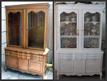
to go in the Craigslist hutch…
%5B6%5D.jpg "IMG_1083 (C&E)")
the large wall clock from HomeGoods…
%5B4%5D.jpg "IMG_1533 (E)")
the iron chandelier from eBay…

the A.D.O.R.A.B.L.E. blue and green bunny tassel sweet Gloria made for me.
")
and the “Abigail” rug from Ballard Designs

In fact, this photo of the Abigail rug …

and this photo were my inspiration for the breakfast room.

Ultimately, I decided the prints just seemed a little too “light and fluffy” so I left the store without them.
Then, in my oh-so-typical fashion, I continued to think about them for the next 2 days…which is usually a sign I should have bought the very thing(s) I can’t stop thinking about!
Back across town I went, hoping the prints were still there.
Fortunately, they were!
Using a bottle of acrylic craft paint I already had on hand, I painted the frames black. But rather than paint them completely, I was painstakingly careful (with the aid of an itty bitty, teeny, tiny art brush) to leave just a little of the original gold detail so they still had some dimension and interest.

To my eyes (which are probably permanently crossed now), painting the frames black made a huge difference.
%5B6%5D.jpg "IMG_2294 (C&E)")
%5B6%5D.jpg "IMG_2295 (C&E)")
%5B6%5D.jpg "IMG_2292 (C&E)")
%5B6%5D.jpg "IMG_2296 (C&E)")
“BEFORE”

“AFTER”

Now that the frames have had a little makeover, I think these prints are going to make a great addition to my French Country inspired breakfast room.

Linking up to the 43rd Power of Paint Party @ Domestically Speaking


+R+(3)+tilted.jpg)


+green+frame+template.jpg)

+(E).jpg)
+(E).jpg)

+green+border+template.jpg)
.jpg)


15 comments:
LOVE them!!! & yes the black frames make the difference. BUT because I am from Holland (MI. :) & am 100% Dutch, I Love delft & windmills.. But also am too, in love with anything with topiaries.
Good choice, can't wait to see them hung.
Have loved watching, as you put your new home together.
Oh yes painting the frames black really made a huge difference. Love the prints. Can't wait to see your room come together.
Jocelyn
http://justalittlesouthernhospitality.blogspot.com/
How fun these are going to look girl...You have wonderful taste my Dear friend...How that kitchen coming?? Hope all is well in your world my friend...Hugs and smiles Gl♥ria
Oh Sherry, those prints are beautiful and will be so PERFECT in your breakfast room. I'm so glad they were there when you went back for them. The paint job is lovely! I can't wait to see the finished project. How is your kitchen coming along?
It's amazing how much different they look with the dark frames. I have some I need to do just the opposite to--gold turning white as I've found with my new wall color, gold looks awful and white is soooo much better looking. I want to see it all together asap. ;D ♥♫
What luck for you when you went back and they were still there, they will look lovely in your breakfast room
Suzann
I have painted so many brass/gold frames over the last year. I am trying to get rid of anything that hints of gold.
I would have snapped those prints up in a heartbeat - and wow, love the makeover on the frames!!! Fabulous.
:)
ButterYum
I love them all, everything is looks perfect and antique, It's looks so different with dark frame.
French country furniture
They are so much more beautiful with the new paint job.
You sound so much like me. I have done that so many times in my life. Hubby just laughs at me and says "You know you will come back for it, so get it now." HA! H!
Willow
I love your new prints - and the black frames are perfect! I can't wait to see the breakfast room when it's all put together. It's going to be wonderful! You've got a great plan. Love your inspiration photos.
~Adrienne~
Cute prints. They look much great in the black frames! I love that table. And the bench matches it perfectly. I also love all the other touches you've picked out like the chandelier and blue and white china!
If there's one thing I've learned, it's to never leave something behind at the store. I did a post on this looong time ago lol!
I think the prints look fabulous after you painted the frames. They were sweet already but the black makes the topiaries pop. Great job.
Deanna :D
Hi Shari,
I really like these prints, and look so much better with the new makeover!
Debbie
I adore that bench! Beautiful.
Post a Comment